E-learning series
- Year: 2020
- Role: Lead Designer
- Team: Asterisco Team
- Product: Responsive HTML e-learning
- Timeline: 2 months
Built with:


In HR, there are always a lot of internal procedures to read and memorise. Our client, a company in the financial sector, gave us the task of improving the bureaucratic procedures for their employees.
Previously, the material consisted of several simple PDF files. Then we revised the content and released a 10-issue e-learning series.
I was responsible for creating samples, creating the visual guidelines, and guiding the other designers to meet delivery standards and quality.
Here I show you the process behind the creation and all the challenges we faced during the project.
What you will find in here:
Click on the items below to go to a specific subject or scroll down.
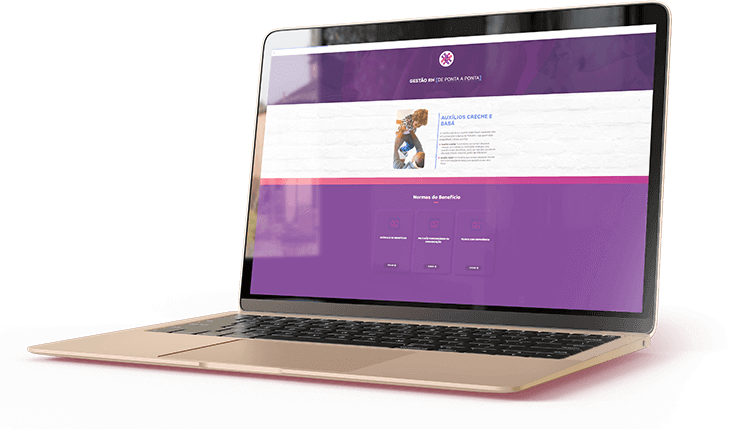
- Project overview
The client
They are part of the Universidade Corporativa (how they call their training centre) within a big Financial Company in Brazil and hired us to build their online materials for the HR employees.
The users
- HR Employees from a financial company
- Not familiar with complex interactions
- Busy with several tasks
- Take the course during their working hour

Problem to solve
Employees from the HR department have to memorise and work with several procedures daily.

Goals
Streamline processes, reduce the effort to find and memorise internal procedures and increase work quality.
Leadership challenges
- Assure quality
- Lead designers working simultaneously
- Extensive materials
- Short deadline

Pillars of experience
- Objectivity
- Easy navigation
- Quick consult
- Visually pleasing
- Responsiveness
- Planning
Information architecture
Prototype and Validation
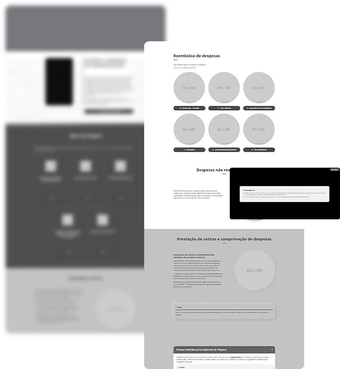
We evaluated the project internally using a low fidelity but functional prototype, and after adjustments, we designed a high fidelity prototype to test and validate along with the client.
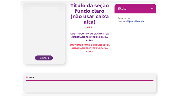
After the tests, we decided to reduce the variety of components and simplify some UI assets to streamline production.
Output
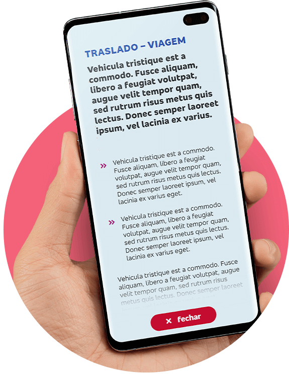
We decided on HTML/CSS, using our one-page framework, because of responsiveness, production agility and compatibility with older browsers (IE11), an essential requirement.
- UI Style & guidelines
Colours
The client’s brand book is colourful and very diverse.
Those colours above are the primary colours of the palette and the most used is the red hue, full of energy and refer directly to the main brand.
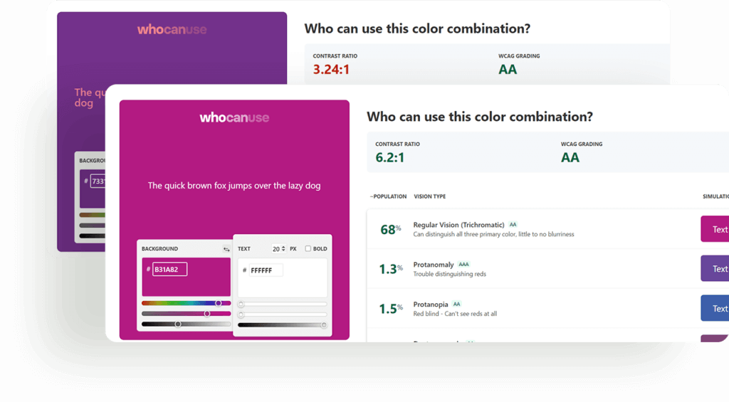
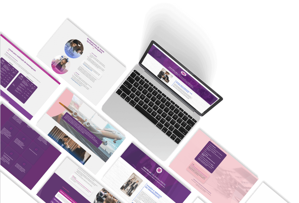
In this project, we decided to prioritise the purple hue and the brighter shades to make the content more comfortable to read.
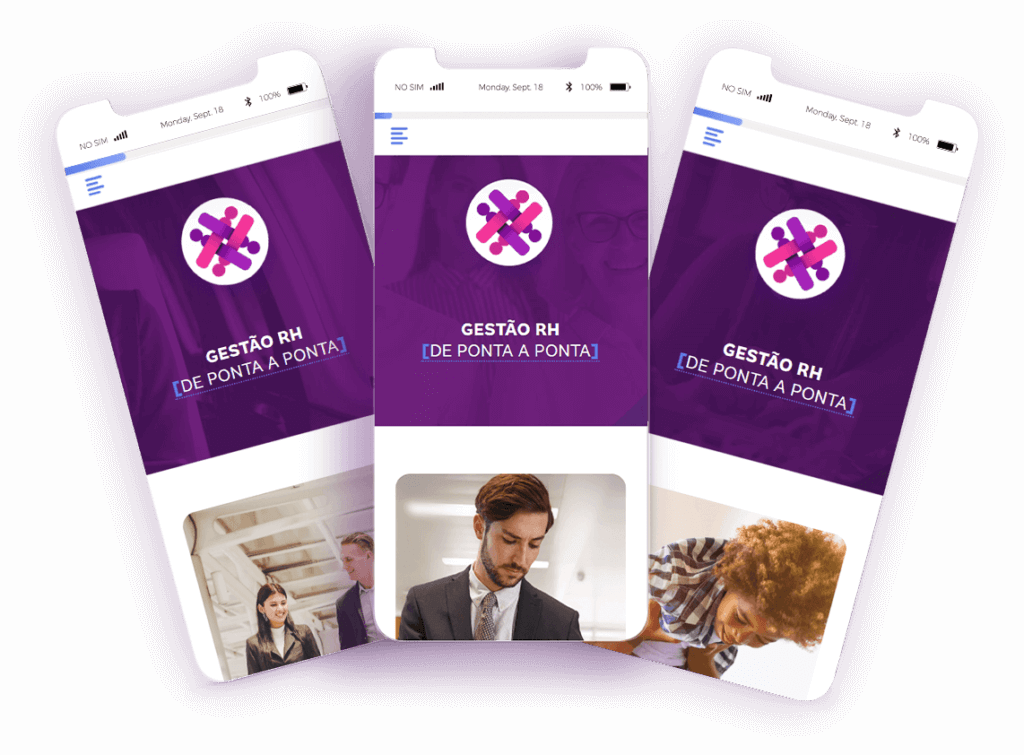
Guidelines
I standardised the header and first section to unify all materials, created a symbol and added decoration to the title. Each issue has its unique background picture related to the course’s subject.
The symbol was created to remind a group of people working together referring to the HR common tasks and created a different treatment in the “De Ponta a Ponta”, which means end-to-end, to emphasise this part.
Grid
The framework used in this project is based on 12 columns and has responsive breakpoints.
Style strategy
Our goals with the visual identity were to reduce eye strain, help the employees learn and remember the content and prevent cognitive overload.
To accomplish these goals, we established the following strategies.
- Using round corners*.
- Prioritising bright colours, instead of the primary red.
- Soft shadows (neumorphism.io).
- Meaningful images and icons.
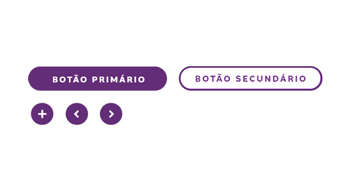
- Reduce the variety of interactive components.
* We preferred using round corners because they are easy on the eyes. Our research showed us that popular user interfaces, like iOS and Material Design, are all rounded.
Assets library
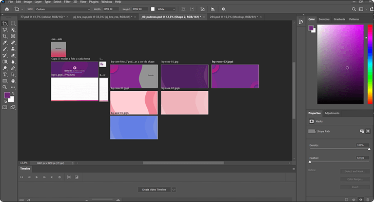
To ensure the ease and speed of the workflow and maintain the visual standards and quality, I created two libraries.
Thanks to these libraries, we built extensive and high-quality materials within a couple of days, which was the perfect pace for delivering the project on time.
- The HTML library has snippets of the components, like buttons, compositions, titles and more.
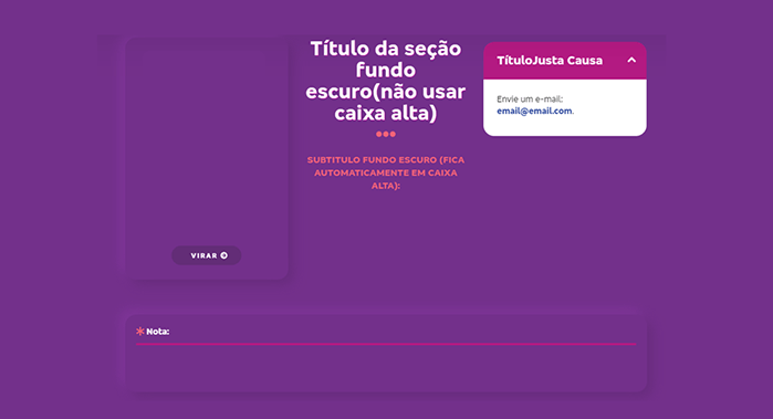
- The Photoshop library has image compositions using smart objects, masks and patterns.
- Strategy
Features
|
Problem
|
How to fix?
|
|---|---|
|
How to easily find information?
|
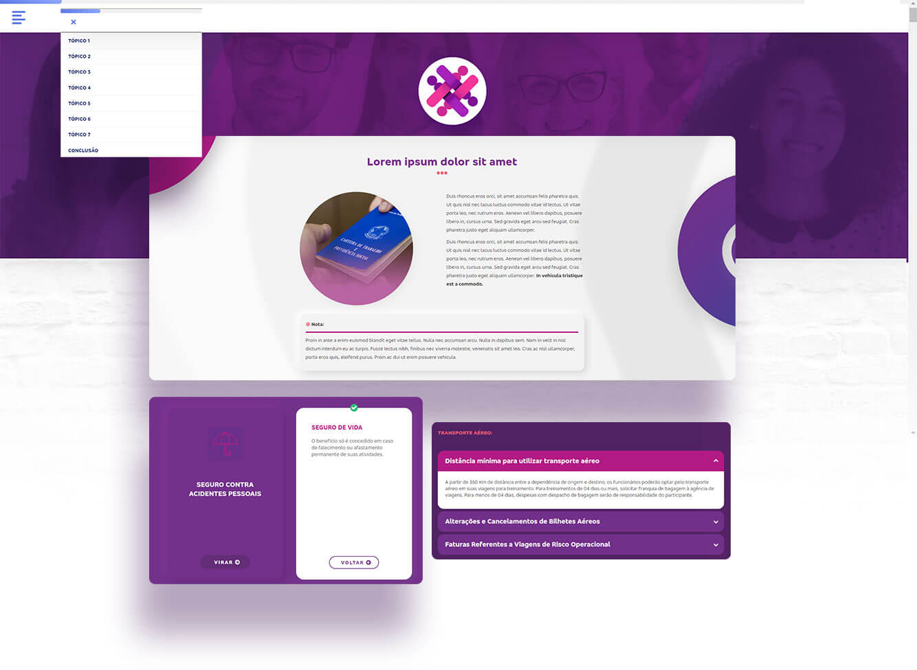
Insert a navigation menu with the primary topics.
|
|
Unlocked content for free navigation.
|
|
|
How to ease navigation and prevent cognitive overload?
|
Use the most basic interactive components and a maximum of three types of components
|
|
How to prevent eye strain?
|
Prioritise shades of purple and bright colours.
|
|
How does the user knows he/she achieved the end of the content?
|
Progress bar fixed on the top of the screen.
|
Accessibility
- Outcomes
- Conclusion
This project was great to work on due to the great team involved. The validation steps were assertive and fast, which helped me to fix any problem faster.
My biggest challenge was to create an easy to replicate strong structure without losing quality. It helped me improve my knowledge in HTML/CSS, and I applied some methods from the book “Atomic Design” by Brad Frost to help me build the intelligence behind the components.
