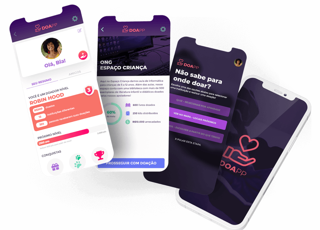
Doapp
- Year: 2020
- Role: UX/UI Designer
- Team: Bruna Atanes, Lis Mariano, Herbert Kietzer and Paula Kietzer.
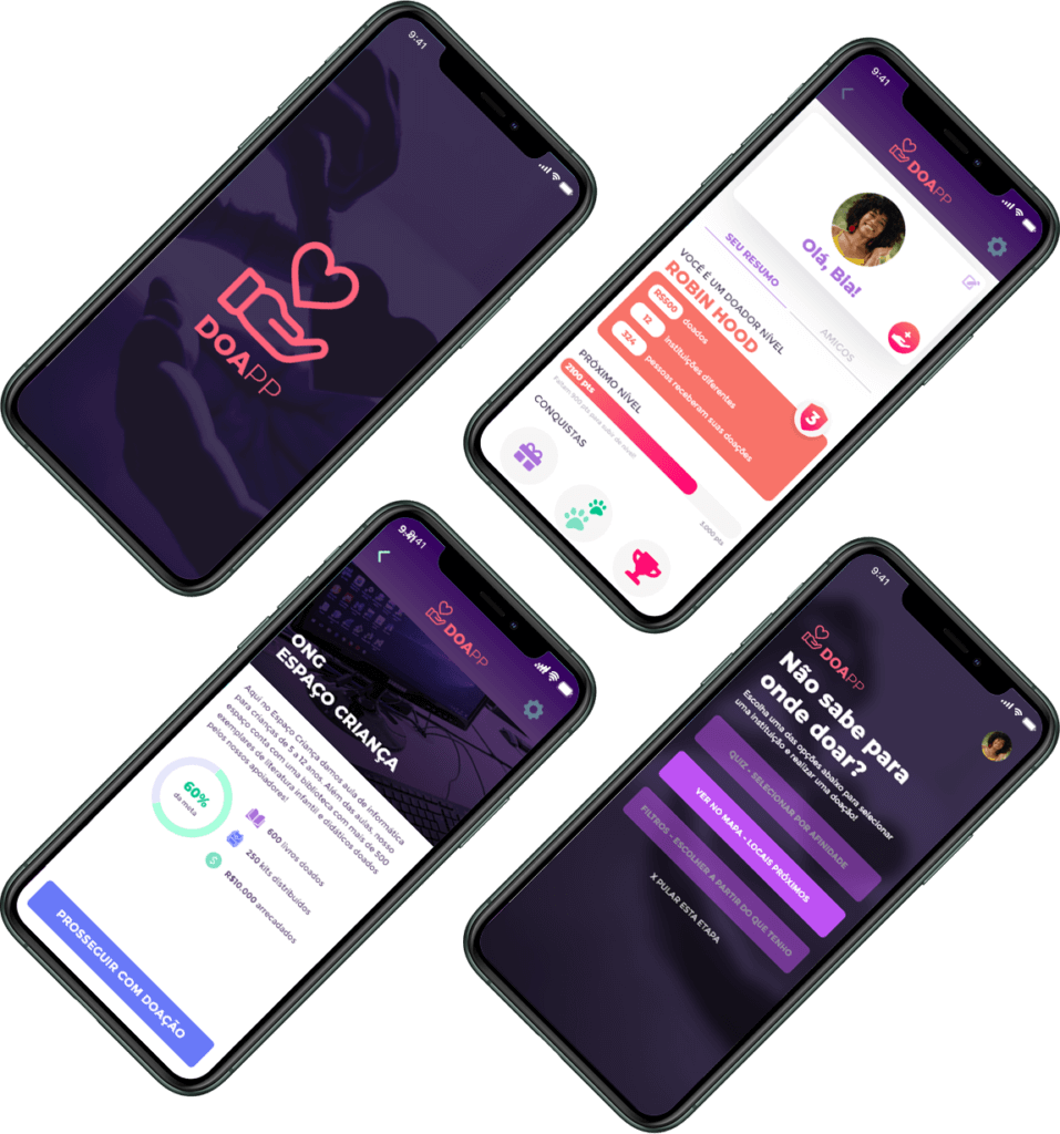
- Product: Mobile app prototype designed in Adobe XD and inVision.
- Timeline: 1 month
Built with:


Brazil is a beautiful country with massive social inequality. As an exercise for the UX Master Class at Miami Ad School, we wanted to impact society by helping people in need receive donations.
We notice that not everything that people donate is helpful for who is receiving. For example, a community kindergarten manager said to one team member that sometimes people donate toys and clothes on Christmas, which is nice. Still, the children need toiletries and scholarly material the whole year.
We started thinking about our problem: How to engage people to donate things they don’t use anymore? How to reach people in need? What kind of stuff will be helpful for them?
We created this mobile application to help to solve these problems. Check below our creative process and the methods we used to bring value to the final product.
What you will find in here:
Click on the items below to go to a specific subject or scroll down.
- Project overview
Users
- People between 25 - 50 years old that are into technology have something to donate but don’t know how to find an NGO.
- NGOs - Non-governmental organisations and people in need.

Goals

Problem to solve
Delivery helpful donations for people in need.

Pillars of experience
- Objectivity
- Easy navigation
- Quick consult
- Visually pleasing
- Responsiveness
- Planning
Ideation
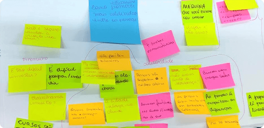
The first step was to understand how to help people in need. After deliberation, we decided to make a solution to connect wealthy people with NGOs related to impoverished communities.
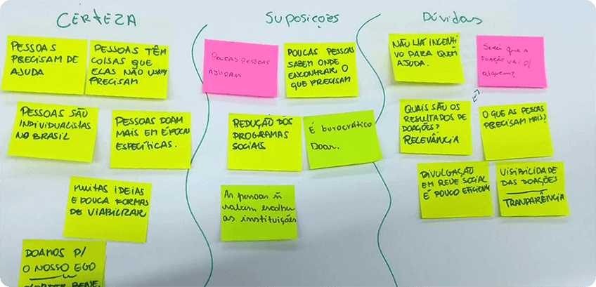
The next step was to write down many suppositions we had regarding the problem and then separated them into three categories: certainties, assumptions and doubts.
Hypothesis to test
- Many people do not help because they don’t have this habit and don’t know what to donate.
- NOGs and people do not always receive what they need.
- People just remember to donate on holidays, like Christmas.
- People don't know where to donate.
- People in need don't know where to find what they need.
- Donate is way too bureaucratic
- Only few people help NGOs
- There is no transparency in the donation chain.
Validation
To validate our hypothesis, we used the framework Validation Board from Lean Start-up Machi.
As it was an exercise, we tested it by researching on Google and asking close friends who fit the target audience for their opinion.
Validated hypothesys
- Many people do not help because they don’t have this habit and don’t know what to donate.
- NOGs and people do not always receive what they need.
- People just remember to donate on holidays, like Christmas.
- People don't know where to donate.
- Wireframes & strategies
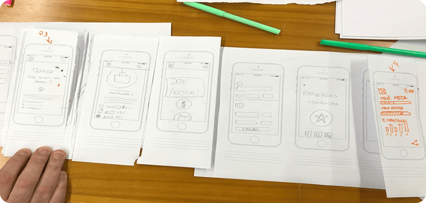
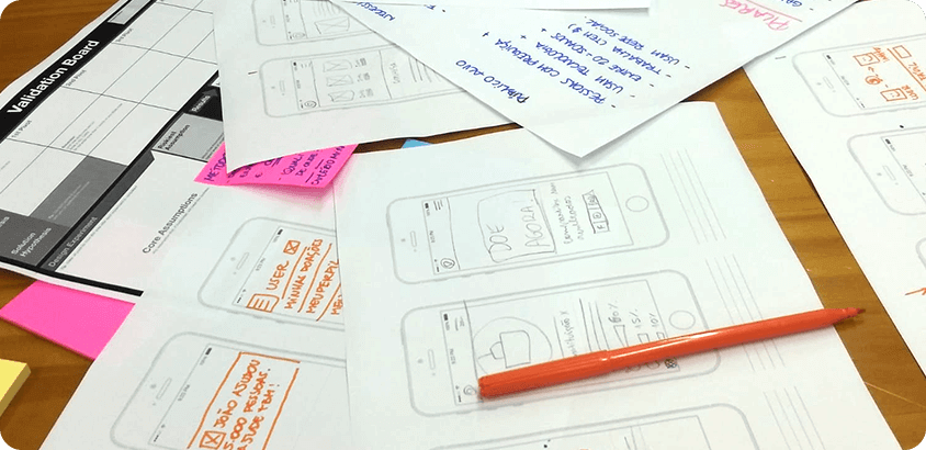
To generate ideas, we did an exercise in which we had to design at least eight screens each in a few minutes to discuss further.
In the end, we had 32 different ideas, some of them overlapped, but it was a speedy and creative process that helped us generate ideas and define the features of our project.
After that, we merged some ideas and elected the best ones to define our scope.
To guide our ideas in this ideation process, we established three engagement strategies:
- Gamification - We designed the gamification experience to motivate people to donate and care more about NOG and people in need.
- Social media integration - We planned it to be a good asset for spreading news and bringing more people into the product.
- Social impact - The primary goal is to bring social impact. Beyond money donations, giving visibility to NOG’s is crucial to help society.
- User flow
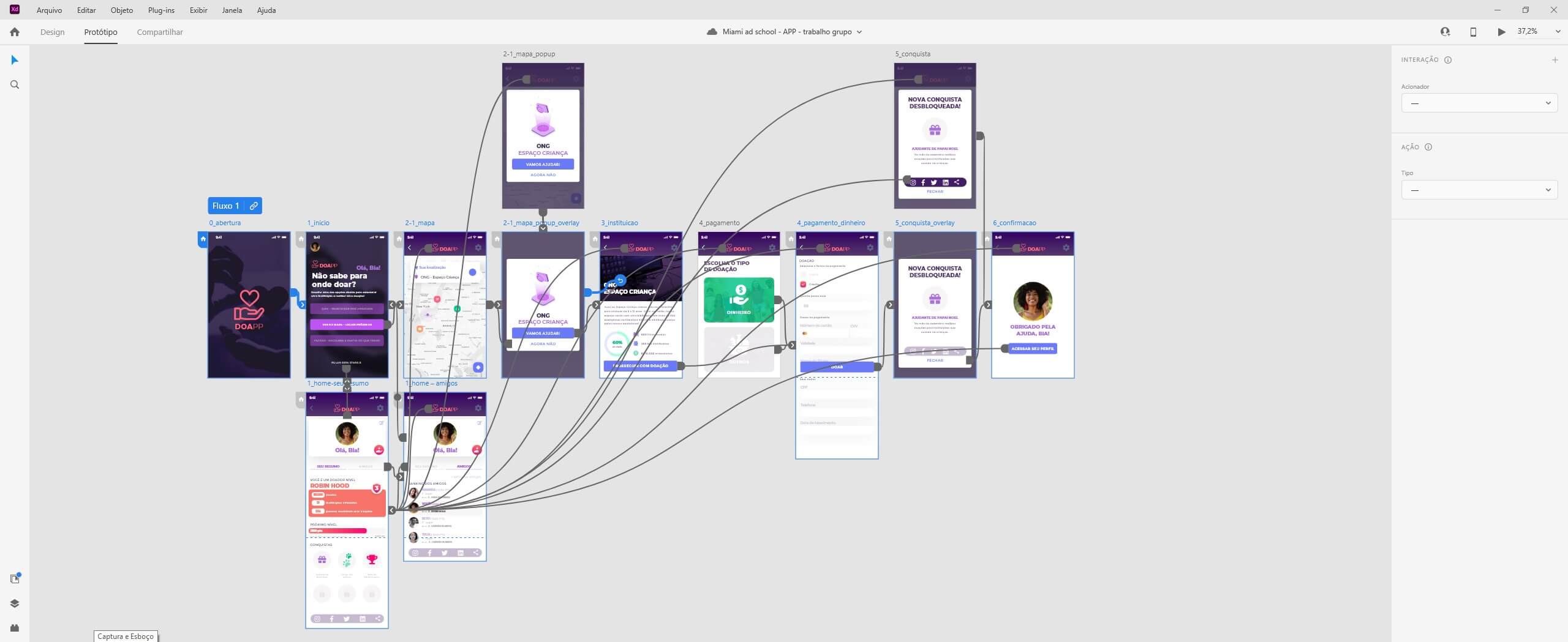
After defining the scope, we planned the user flow detailing all features and afterwards, we defined the MVP based on the most crucial steps. The highlighted steps are the ones we decided to design for the class


- UI Style
Colours
Typography
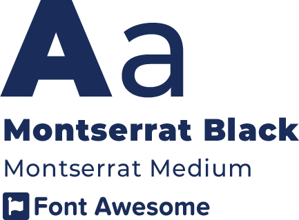
We decided to use Montserrat due to its diverse font-weight and being a sans-serif family, which is recommended for digital displays.
Furthermore, this font family is modern and matches the mood we want to convey with our interface.
Iconography
The icons used in the interface are from FontAwesome and Flaticon . We preferred to use filled icons in the system to raise contrast to the linear brand.

Brand
The product brand has a simple structure, symbol + product name; nonetheless, we wanted to use a meaningful symbol that refers to donation.
The name is the merge of the words: DOAR + APP.
The word “doar” means “to donate” in Portuguese, and combining it with the word app became DOAPP.
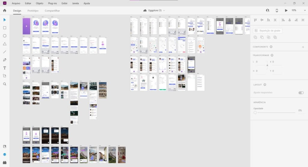
Design system
- User test & outcomes
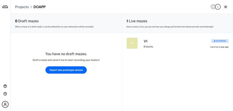
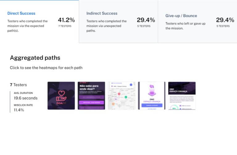
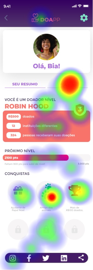
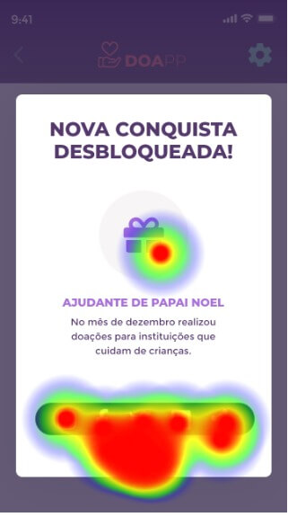
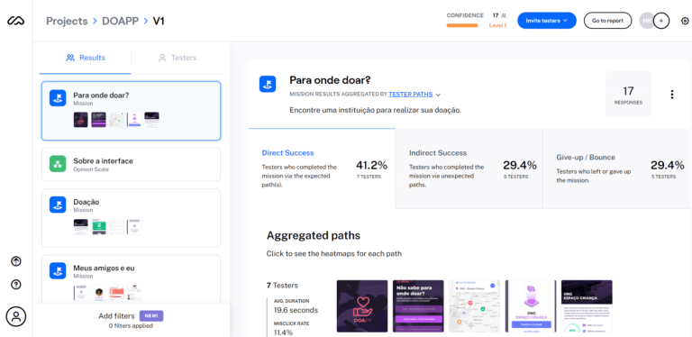
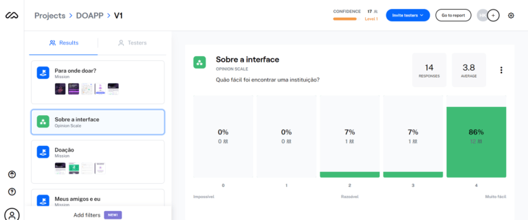
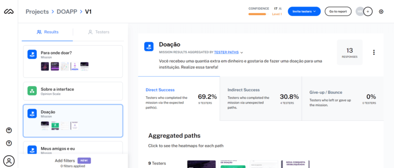
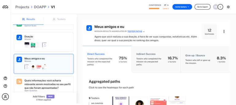
We uploaded the prototype into the online tool Maze and sent it to 12 people to validate the user flow and features.
At the time, Maze was compatible only with inVision and Sketch. Then, for the exercise, we rebuilt the interactions on inVision to use Maze.
Thanks to this step, we reviewed the user flow and fixed some inconsistencies.
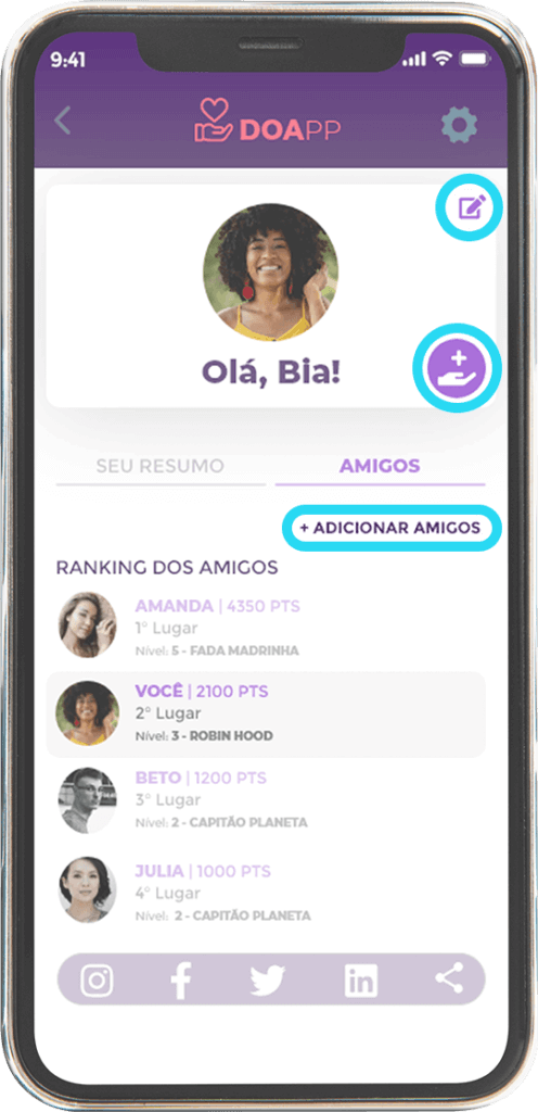
The most significant changes were:
- Add a button to edit profile.
- The option to Add friends inside the "Friends" tab.
- Add a shortcut for the donation section (new donations and history of the last donations) on the profile screen.
- Allow to skip donation and go straight to the user profile.
- Prototype
- Conclusion
Despite not being an actual project, it was terrific to work with such a talented team, a meaningful subject and all the discoveries in the process.
I was also able to experience a different field from my daily tasks at work, build a mobile interface for the first time, and work for the first time with a Design System.
